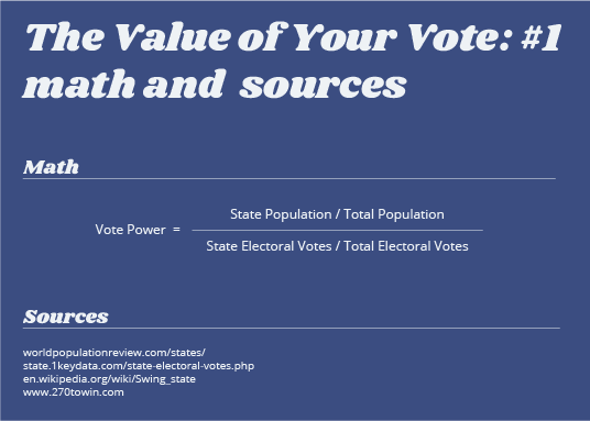

I have always imagined my vote is a hard and fast value that is steady throughout time. One person, one vote. This is not true for various reasons. With influence by the electoral college, the party you vote for, and even the election year, your vote value can fluctuate above and below the 1 person 1 vote value. This is the first in a series of graphics I am working on to explore the value of an individuals vote power throughout history, geographic location, and the party they are affiliated with.
I am attempting to provide a non biased view purely based on numbers. Infographics, statistics, and math are not my strongest skill set so if you see any issues with my math, reasoning, or have any design critiques, please feel free to let me know. I hope you find these graphics interesting and informative.